At myOnvent, we take pride in our platform being accessible to everyone – there’s a reason why our tagline is “Next generation events for all”. Quite early in our platform-building process, our Design Team took steps to ensure that our design practices and policies followed the Web Content Accessibility Guidelines (WCAG) – a series of regulations that “make web content more accessible to people with disabilities” (W3C). This piece was written by our Design Lead, Den Tkachenko, and will explore the reasons why design and accessibility go hand-in-hand, and a few key processes we’ve undertaken to have our platform Accessible for All.
“Being accessible should mean that nobody is excluded from doing or using something, and they should be able to do so with a reasonably equal amount of effort and time as those without a disability” – InvisiblyMeBlog
Accessibility can be a strange or vague term, as it has so many varying applications in different fields. However, when it comes to web apps and web design, the core message remains: “Web accessibility means that people with disabilities can use the Web equally” – Shadi Abou-Zahra (Accessibility & Standards Expert)
Here is the key point: if you have a product, it should be accessible for all. Universal. Respectful.
In design, you never really know the point at which you should take care of accessibility. We found that the best is to do it right from the beginning (we didn’t, but it’s never too late to fix it!!). In the early stage of our accessibility matureness, a client of ours (Victor Nystad from Equinor, Norway’s largest oil & gas company) got in touch with our Design Team with a set of suggestions on how to improve accessibility on our platform. This spark opened a whole new chapter for us: to ensure that each and every participant of myOnvent’s platform was equal and received a full platform experience.
Today there are 3 main pillars relating to inclusivity in design. As NN Group affirms, “two concepts related to inclusive design that are often mixed up with it are accessibility and universal design. All three concepts aim to reduce barriers between humans and technology and create inclusive experiences”.
The difference between Accessibility and Universal Design is that first aims to “ensure that interfaces and technology can be used by people with disabilities”, while the second aims to “create one experience that can be accessed and used to the greatest extent possible by all people”, which would mean creating “a single design solution without the need for adaptations or specialized design”. Long story short, inclusive design is a golden middle ground between WCAG Accessibility rules on one side, and costly universal design that often entails multiple functional variations of the interface on the other.
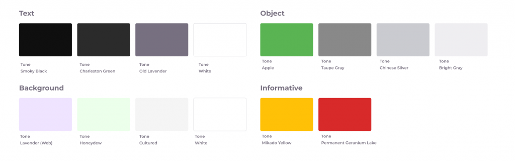
(myOnvent’s colour scheme divided by the object type)
Inclusive design is a golden middle ground between WCAG Accessibility rules as one option, and costly Universal Design as the other.
Now, let’s quickly jump from the more boring theory to something more engaging – practical examples and recommendations. (Disclaimer: This reading is not a Wikipedia article, and we only cover 3 core inclusive design principles. You can find more at w3c, AIM, and NN Group.)
WHY? “More than a quarter of the world’s population — some 2.2 billion people — suffer from vision impairment, out of which one billion cases could have been prevented or have been left unaddressed” – World Vision Report 2019, World Health Organization (via DownToEarth).
HOW? Use a good combination of size and colour contrast. WCAG provides 3 levels of access: A (easiest), AA, and AAA (strictest). At myOnvent, we decided to meet AA requirements as a baseline, and AAA where possible (this is because we providing a virtual event experience for all, which means not everything can be just black and white – that is the usual recommendation for AAA-level).
(These are two different body-text styles we use at myOnvent, and both are above 12pt.)
Font Size: not less than 12pt. This is a rule of thumb.
Text Contrast Ratio: 4.5:1. Never lower. Sometimes, where the text is small, we enhance the contrast ratio to 7:1 which meets the highest AAA standard – usually we do this when the text is a must-read.
(Examples of different Text Contrast Ratios)
At the #Config Conference organized by Figma, guest speaker Anna Cook explained that the ideal “contrasts of button borders, icons, and other interface elements is at least 3.0:1”. Our designers try to never design buttons or icons with less than A-level contrast, which means 3:1 or above.
(Here you can visually see how the contrast ratio influences the readability – this example also shows how the Stark plugin works).
How can we make sure we’re following the right path? There are a number of tools out there. At myOnvent, we use the Figma+Stark plugin, which shows you the necessary contrast aspects. It’s not a common task to check contrast each and every day, so once we agreed on the rules, the whole design system was updated appropriately. All the colours were checked in pairs and we defined which colours could be used for different texts and for different backgrounds.
TOP TIP: in the beginning, it seems like making inclusive design is an enormous effort. It’s not! Once you set up the design system according to your inclusivity policies, it’s done – you don’t even have think about colour contrast aspects etc, they’re done. And at the same time, having a proper WCAG-compliant design will make the life of lot of your users much easier.
WHY? Focus states refers to any clickable element of your interface that shows up while using keyboard navigation. With at least 1 billion people across the world experiencing some form of disability (via the World Bank), keyboard navigation is a common tool used to interact with different web elements.
HOW? The easiest way is to set up a catchy focus state on each clickable element, in addition to default elements states (such as ‘normal’, ‘active’, hover’, and ‘disable’ – see image below). At myOnvent, we use different backgrounds and the full spectrum of all possible controls. Because we weren’t happy with the focus states embedded by default in the browser, our solution was to create our own focus state that differed from all other states, and was visible with any kind of background: dark, light, coloured, and neutral.
Above you can see different states of the checkbox, including the focused state. We used a dashed 2px outline with the brand colour so that it would be visible with both dark- and light-themed backgrounds.
A designer should not only provide the focus state but also make sure it is properly implemented in Development. This means that all clickable elements must have its proper <div> properties, where button will be <btn> and not <a> (link), etc. Additionally, you should also ensure that the keyboard navigation goes from top left to right with the header as the first step, and again from left to right as you go along (at least for RTL interfaces). See the photo below for we do this:
In the image above, you can see the direction of keyboard navigation flows (left to right, top to bottom, etc.)
“To join in the industrial revolution, you needed to open a factory; in the Internet revolution, you need to open a laptop.” – Alexis Ohanian (Reddit co-Founder and Executive Chairman)
WHY? Despite the fact that opening a laptop is an easy task, making mistakes online is still quite normal. However, if your interface leads users to make mistakes, it’s a bad experience. At myOnvent, we try to reduce the possibility of making mistakes. Having a product for everyone means crafting every steps in the user flow similar to what you can see in accessible cities – each step with its own signs and buttons, like traffic lights.
HOW? As the WCAG Guidelines dictate (Success Criterion 3.3.6 Error Prevention):
“For Web pages that require the user to submit information, at least one of the following is true:
– Submissions are reversible
– Data entered by the user is checked for input errors and the user is provided an opportunity to correct them
– A mechanism is available for reviewing, confirming, and correcting information before finalizing the submission.”
In this image, you can see the variable components in the input field with help text, placeholder text, and text on the error state – 3 easy steps to make an errorless experience.
There is no golden rule on how to meet this requirement, but there is a simple checklist to check when it comes to the user flow:
1. Is the submission reversible?
2. Is the user’s data checked and validated?
3. Is the data can be edited and changed after it’s filled?
In a single day, a regular internet user will make lots of actions that provide data. Things as simple as signing up to a new service, selecting a date and time for a hairdresser appointment, completing the payment form to close the electricity bill, etc. Whenever the myOnvent platform has an input field, it always meets the errorless approach so that the user feels comfortable and can use our platform without any interruptions.
It’s not a big deal to design a web application. But, in order to make it good, you should take care of all your users. That way, regardless of any disability, all your users are happy to use it.
WHY? Because as you create your inclusive and universal experience, you actually fix a lot of small problems for all users, and get back all the corners you cut.
HOW? Just give it a try – you will never step back.
If you’re interested in organising an online event and Accessibility and Universal Design are important to you, we would be really happy to explore our platform further with you – just drop our team a quick message and we’ll set something up. Speak to you soon!!
Subscribe to get free tutorials, tips, news and development updates to your inbox


